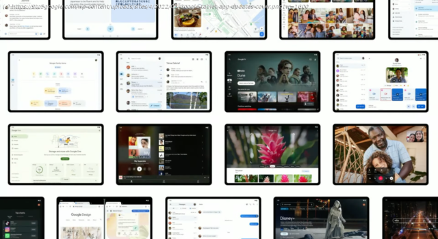
Here’s every Google app on Android that has a tablet update and what’s still to come. At I/O 2022, Google announced that it will update 20.
At I/O 2022, Google announced that it will update over 20 of its first-party apps for large screens in a show of its commitment to the form factor. This will undoubtedly improve the experience for existing owners and is meant to encourage other developers to do the same. Here’s every Google app on Android that has a tablet update and what’s still to come.
Update 6/11/23: In exiting preview, the Google Home app also rolled out some tweaks to the tablet UI. This includes placing the contents of each tab in a container, while there’s a secondary navigation drawer when viewing Spaces in the Favorites tab and in Devices.
Ahead of the Pixel Tablet and Fold, Google’s excellent Recorder app has dual-column layouts throughout the interface. This starts on the homescreen to better view past recordings and extends to the player where you can see the waveform and transcription side-by-side. It’s also present when you’re recording audio.
Following the large screen layout in October, Gboard now has a split keyboard that works quite well given how Android tablets are typically pretty wide. You have the ability to have keys duplicated on the left and write, while switching to the standard layout is quite fast.
~
Update 4/4/23: Navigation rail with four tabs, navigation rail, and Create FAB. A search bar spans two-thirds of the screen, while settings and your account avatar appear at the top-right corner. Overall, it looks a lot like the desktop website. —Google Keep III
Long-press on notes to open side-by-side in a new window. There’s also the Single note widget.
Google Contacts has been updated with a navigation rail and dual-column UI where your list of people appears at the left and details are at the right. The search bar doesn’t span the entire width of your screen here. The app’s other tabs have not been updated.
~
Update 12/21/22: Google Meet has a two-column UI in both portrait and landscape orientations. The homescreen shows your call history, as well as upcoming meetings, on the left. Tapping loads the contact details page on the right for a nice info-dense interface. This dual-column layout is also found in the Meet tab of the Gmail app.
The previous UI was just a stretched out list view that did not take advantage of the available screen real estate, especially in landscape.
~
Update 12/9: Given the available screen real estate, Google is putting the live collaborator avatars into the app toolbar. To the right of the document name, you’ll see who is currently viewing a file, just like on the web. This information was previously housed in the overflow menu. This should apply to Google Docs, Sheets, and Slides.
Keep’s dual-pane redesign has widely rolled out with a key tweak that lets you quickly switch between the Full screen and Dual pane views. This button appears in the search field next to your profile avatar.
~
Update 11/24: The Google app has switched to (beta version 13.46) a navigation rail that’s positioned just above where you’d place your thumb rather than being centered, top, or bottom-aligned. It’s used for the Discover feed, Search results, and Collections tab.
This will presumably get updated to Material You in the future, while Google should play around with padding so there isn’t as much empty space and more content.
Currently in Public Preview, Google Home starts with a Material You navigation rail that makes use of pill-shaped indicators. You only see the text label of the current tab. In Favorites and Devices, Google switches to a three column layout for tiles. It’s up from two on the phone app, but a fourth would probably look fine, with such a view used by the Edit/Add favorites view.
Meanwhile, Automations and Activity use a single column layout that is too stretched out, while Google looks to have not yet optimized the Settings column with a lot of left/right padding.
The main views are mostly tablet-optimized, but going a level deeper into various device menus presents some issues that need to be adjusted and rethought before the stable launch. In comparison, the Google Home preview on iPad uses a bottom bar and it’s not that optimized.
~
Update 11/18: Google Docs on Android is getting “full mouse support” that matches the website’s cursor experience.
For example, clicking and dragging across text will now select that specific text instead of panning the entire document.
In Drive, drag and drop can now be used to organize your files and folders, with Google noting how this “can be done either in the two-window view or in the single app view.


